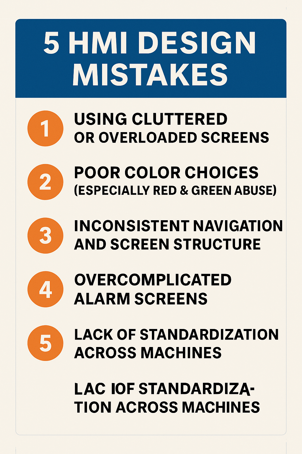
5 HMI Design Mistakes to Avoid: A Practical Guide for Better Industrial Interfaces
- PLC Play Ground
- 0
- Posted on
5 HMI Design Mistakes That Hurt Usability (and How to Fix Them)
A Human–Machine Interface (HMI) is one of the most critical components in industrial automation. It’s the operator’s window into the machine.
Yet many HMIs are still designed with confusing layouts, poor visibility, and unnecessary complexity—leading to downtime, operator errors, and slower troubleshooting.
Here are the five most common HMI design mistakes and the practical steps you can take to avoid them.
1. Using Cluttered or Overloaded Screens
One of the biggest problems in HMI design is packing too much information into a single screen.
When operators are overwhelmed, they spend more time searching for what they need and are more likely to miss important details.
Common symptoms:
- Multiple pop-ups covering key information
- Too many buttons, colors, or indicators
- Tiny fonts or unlabeled icons
How to fix it:
✔ Prioritize essential information
✔ Break content into multiple screens
✔ Use clean layouts and consistent spacing
✔ Avoid decorative graphics that add no value
A clean HMI boosts speed, accuracy, and operator confidence.
2. Poor Color Choices (Especially Red & Green Abuse)
Many HMIs rely heavily on red and green, often using them incorrectly.
Common issues:
- Green used as a “default” color (should represent a safe or running state)
- Red used for normal states (should be reserved for alarms)
- Color-blind operators may struggle with red/green signals
How to fix it:
✔ Use green only for good/safe states
✔ Reserve red exclusively for urgent alarms
✔ Use shapes, icons, and contrast—not just color
✔ Maintain a standardized color palette
A disciplined color strategy is vital to safe and reliable machine operation.
3. Inconsistent Navigation and Screen Structure
If every screen is laid out differently, operators lose time learning how to navigate.
Inconsistent navigation often leads to training gaps, mistakes, and slower troubleshooting.
Common signs:
- Back buttons in different places
- Menu styles changing from screen to screen
- Unpredictable navigation paths
How to fix it:
✔ Use a universal header and footer
✔ Keep navigation buttons in fixed positions
✔ Apply consistent font sizes and section layouts
✔ Use breadcrumb trails for multi-step workflows
Operators should know where they are at all times.
4. Overcomplicated Alarm Screens
Alarms are supposed to help operators react quickly, but bad design makes that impossible.
Common problems:
- Long lists without filtering
- No timestamp or status visibility
- Alarms that don’t clearly state the cause
- Repeating nuisance alarms
How to fix it:
✔ Group alarms by severity
✔ Use clear descriptions, not codes
✔ Show active, acknowledged, and historical states
✔ Add filtering and search features
A well-designed alarm system reduces downtime dramatically.
5. Lack of Standardization Across Machines
When each machine or line uses a different HMI style, operators waste time adjusting.
Common issues:
- Different fonts, layouts, or colors
- Unique symbols or naming conventions on each machine
- Operators requiring separate training for each line
How to fix it:
✔ Create (and enforce) an HMI design standard
✔ Use the same icons, terminology, and layout principles
✔ Apply ISA-101 HMI guidelines
✔ Standardize alarm behavior and color usage
Standardization makes your entire plant easier to operate and maintain.
Conclusion
Great HMI design isn’t about making screens look pretty—it’s about improving usability, reducing errors, and enabling faster, safer operation.
By avoiding these five common mistakes and following proven design principles, you’ll create HMIs that operators trust and rely on, especially during critical moments.
